
Kraft Chemical
Crafting a New Kraft Chemical
While Kraft Chemical has been in an innovative chemical business for over 75 years, its identity had not evolved with the times. Its original identity was heavy and bold in black and red – an image more consistent with volatile or hazardous chemicals. With ingredients formulated for human use and consumption, Kraft's identity was mis-aligned with its products and created a disconnect with its target audiences.
Modestly updating the logo and changing its color palette, we re-branded the entire look and feel of Kraft's visual and verbal identity to create a brand expression more in tune with its product offerings and customer expectations.

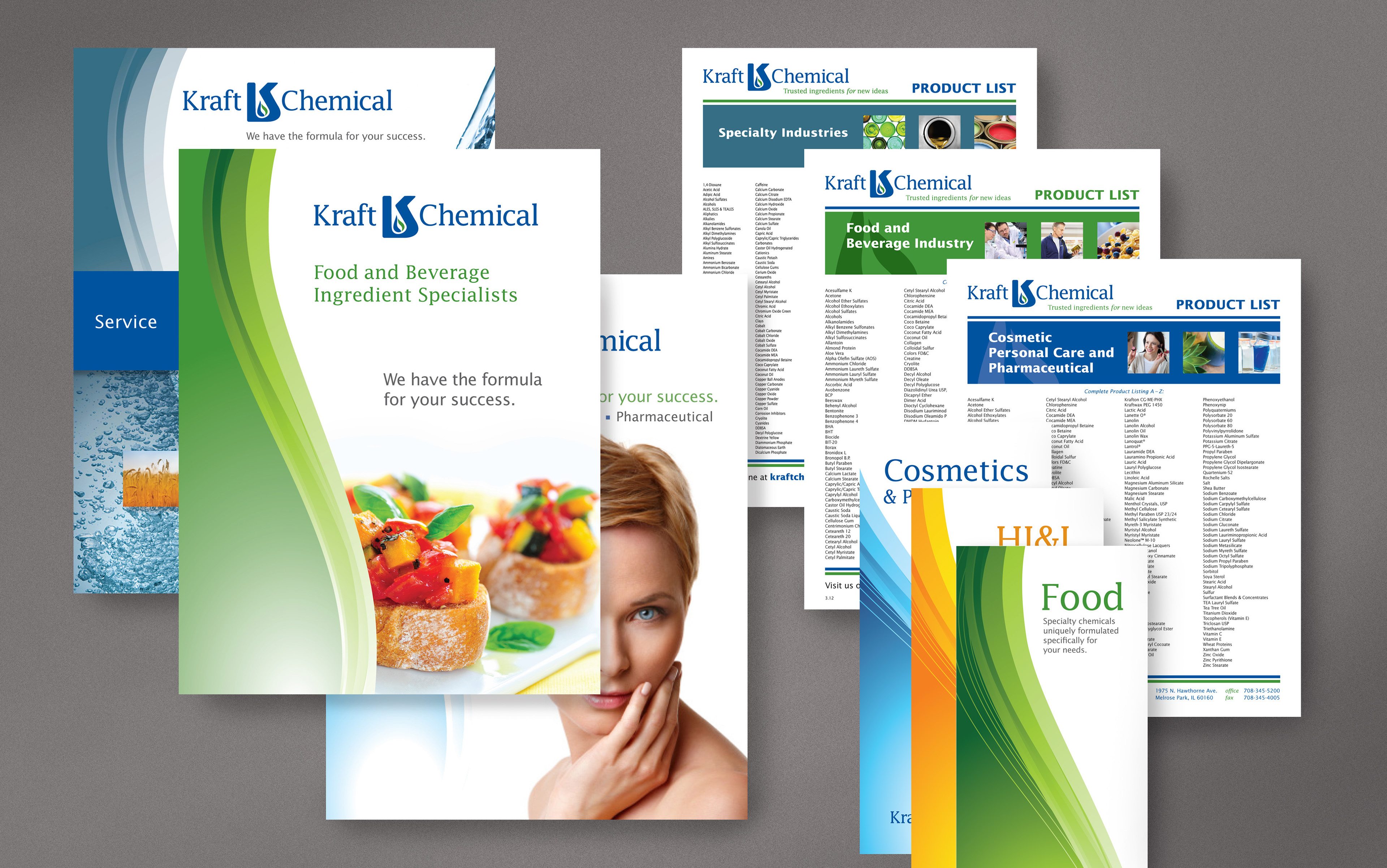
Integrated Literature System

Tradeshow Booth Graphics

Tri-Panel Display System